Creating Navigation Component Contents
In Design Mode  , when you drag the Navigation Component
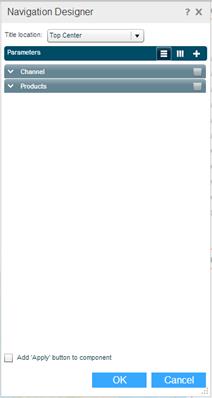
  icon from the Toolbox to the desired area on the workboard, the Navigation Designer dialog box opens for defining the parameters. This dialog box is also activated by clicking the Wizard
  button on a navigation component title bar. You can define several navigation parameters to be displayed in the same component.
To define a new parameter:
1. In Title Location, select the position of the parameter’s title in the navigation component. This applies to the titles of all the parameters in the component (if there is more than one).
2. Click  to display parameters horizontally in the component. Click
  to display them vertically.
3. Click the Add  button to open a new tab, and choose the type of parameter you want to define.
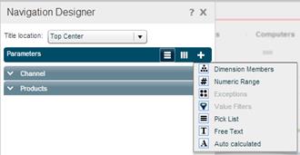
4. Enter the parameter definitions as described in the following sections.
5. To add another parameter to the component, click the Add button, choose the parameter type, and perform Steps 4 and 5.
6. To add an Apply button to the component so that the parameter will be applied after the user clicks the Apply button, select the Add ‘Apply’ button to component option.
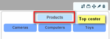
7. Click OK to display the parameter in the navigation component.
Dimension Members
This parameter type is used to add more slicing capabilities to the views on the workboard.
You may want to use this capability especially when there are two views (or more) on the workboard, each based on a different data cube. Since the Slicers Pane can contain measures only from one data source, you will need to use the Dimension Members option to place the measures of the other view in the navigation component so that they can be selected for slicing that view.
The Dimension Members option also allows you to synchronize all the views in a workboard with the same dimension slicing. Once you use the Dimension Members option to place a dimension in the navigation component, selecting the dimension in the navigation component will slice all the views on the workboard that contain that same dimension.
The Dimension Members option provides slicing capability with different types of visualization. For example, you can define slicer selection from a dropdown list or an option button, or a slider.
After selecting Dimension Members, use the fields of this option as described below:
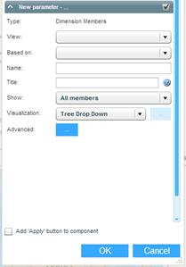
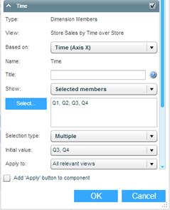
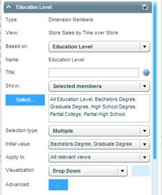
View
Choose the view from which you want to retrieve the dimension.
Based On
This dropdown will list the dimensions of the view you selected. Choose the relevant dimension. To define a slicer for the measures of the view, choose Measures.
Name
Enter a name for the parameter.
Title
The name that will appear as the title of the parameter in the navigation component. Use # as a placeholder for the selected value.
Show
Choose All Members to show all of the members of the selected dimension in the slicer.
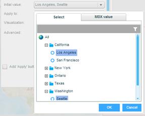
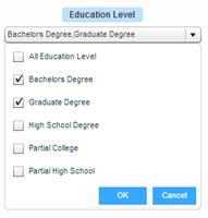
To show specific members, choose Selected Members.In the dialog box that displays, click on a member in the All Members panel and click the arrow to move it to the Selected panel, or just double-click a member.
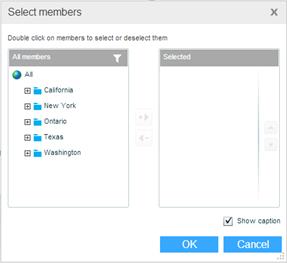
To deselect members in the Selected panel, double-click them. They will move back to the All Members panel.
To search for a member, click Search  , type in the search text and click the filter
  button (or press Enter).
Clicking the Select button opens the Select Members dialog box for making further selections or deselections.
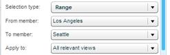
Selection Type
Specify the type of selection allowed for this parameter:
· Single: A single member can be selected for slicing.
· Multiple: Several members can be selected for slicing using Ctrl-click or Shift-click.
· Range: A range of members (from-to) can be selected for slicing. Enter the From member and the To member.
See Use Case Examples.
Initial Value
Click on this field and choose the member that should be the initial selection for the parameter.
You can also define an initial value using MDX. Click the MDX Value tab and enter the MDX statements in the editing box. Click OK.
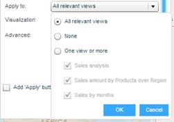
Apply To
Slicing by the slicer you are defining can affect the selected view, other views on the workboard, or all the relevant views (default) on the workboard. Choose the desired option. Choosing None means no slicing will be performed.
Once the Dimension Members parameter is defined, the dimension on which it is based is removed from the Slicers of the view to which the parameter is connected. If the parameter is applied to all views, it is removed from the slicers of the workboard. If there are several views on the workboard and the dimension of the parameter exists only in some, the dimension will remain in the Slicers.
Visualization
Specify the type of control to be used for selection: Selection Group, Selection Group (buttons), Drop Down, List, Slider. Note that when All Members is selected in the Show field, the only Visualization option is Tree Drop Down.
When the visualization is Selection Group, Selection Group (buttons) or Slider, the Advanced Visualization  button is enabled for additional definitions.

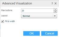
In Max Buttons, enter the maximum number of buttons to show (for option buttons). In Layout, choose how the buttons should be arranged.
Advanced
Click the button to open the Advanced window.
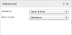
In Applies to, select Slicer if the navigation should perform only slicing, and Slicer & Grid if it should perform the slicing together with member selection in the grid (if the dimension is in the grid).
After selecting Slicer & Grid, choose the way member selection should apply in the grid:
§ Members: regular member selection with no drill down capability on members.
§ Members + drill down: member selection with drill down capability on members.
§ Members + parents + allow drill: member selection, showing parent level, and with drill down capability.
§ Members - flat layout: member selection, in flat layout.
§ Children: member selection, showing only children level.
§ Custom MDX: choose this option to define the member selection via MDX. Enter the MDX statements in the editing box. Click OK.
Use Case Examples
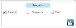
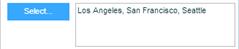
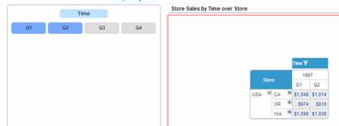
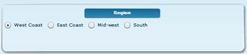
Example 1: Define a parameter for slicing a view by time dimension members
Define a parameter with:
The result that displays in the navigation component:
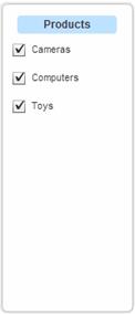
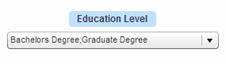
Example 2: Define a parameter for slicing a view by Education Level dimension members
Definition of parameter:
The result that displays in the navigation component:
Opening the dropdown displays the tree of stores to select from.
Numeric Range
This option is used to define a numeric range within which the user can select a value. These values are not connected to any view. Other components can use the Numeric Range parameter values via a placeholder that will be replaced by the value that a user selects in the navigation component.
After selecting Numeric Range, use the fields of this option as described below:
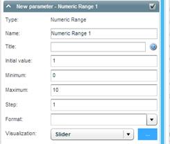
Name
Enter a name for the parameter. You will use this name when embedding this parameter in a formula or as a placeholder. If you don’t enter a name, the parameter name will be “Numeric Range 1”.
Title
The name that will appear as the title of the parameter in the navigation component. Use # as a placeholder for the selected value.
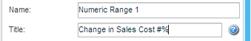
If you don’t enter a caption, the default title “Numeric Range 1” will appear.
Initial Value
Specify the value that should be the initial selection for the parameter.
Minimum – Maximum
The lowest and highest values in the numeric range.
Step
The number of counts to move at every slide or click when selecting a value in the component.
Format
The display format for numbers. For example, ###,###.
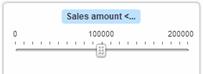
Visualization
Specify the type of control to be used for selection. Slider and Number Stepper are the suitable controls for this type of parameter.
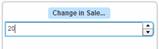
The following is an example for Number Stepper:
Slider Labels
Choose an option to specify how you want the slider labels to appear in the navigation component. Auto means Necto will display the labels automatically. Choose All to display labels for all the steps, or None not to show any labels. To display a label, for example, every 2 steps, choose Every 2.
Exceptions
After defining exceptions for a view, you can use the Exceptions option of the navigation component to define a parameter that will enable users to dynamically change the exception condition values.
After selecting Exception, use the fields of this option as described below:
Connect To
This dropdown will list all the exceptions defined for all the views on the workboard. Choose the exception for which you want to define the navigation control parameter. The relevant values for Initial Value, Minimum, Maximum, and Step appear automatically. You can edit the displayed values.
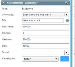
Title
The name that will appear as the title of the parameter in the navigation component. Use # as a placeholder for the selected value.
If you don’t enter a caption, the name of the exception will appear as the title.
Initial Value
The value that should be the initial selection.
Minimum – Maximum
The lowest and highest values in the range.
Step
The number of counts to move at every slide or click when selecting a value in the component.
Format
The display format for numbers. For example, ###,###.
Visualization
Specify the type of control to be used for selection. Slider and Number Stepper are the suitable controls for this type of parameter.
Slider Labels
Choose an option to specify how you want the slider labels to appear in the navigation component. Auto means Necto will display the labels automatically. Choose All to display labels for all the steps, or None not to show any labels. To display a label, for example, every 2 steps, choose Every 2.
Example
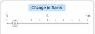
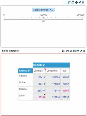
In the following example, the exception condition is defined as “Profit < 8800”. The navigation component enables the user to dynamically change the condition value using the slider (for example, Profit < 7000). The exceptional data in the grid will be dynamically highlighted based on the selections.
Value Filters
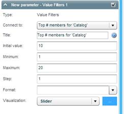
The Value Filters option is similar to the Exceptions option. After defining ranking or value filters for a view, you can use the Value Filters option of the navigation component to define a parameter that will enable users to dynamically change the filter values. For example, if the value filter is “Top 10 members”, the user can change the filter value (e.g. to top 6) and get the matching results in the view.
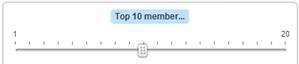
A value filter parameter is defined in the same way as an exception parameter. After selecting Value Filters, use the fields of this option as described in Exceptions. In Connect To, choose the value filter for which you want to define a navigation control parameter.
Pick List
This option is used to define a list of values from which the user can select a value. These values are not connected to any view. Other components can use the Pick List parameter values via a placeholder that will be replaced by the value that a user selects in the navigation component.
After selecting Pick List, use the fields of this option as described below:
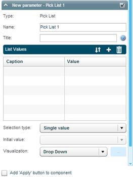
Name
Enter a name for the parameter. You will use this name when embedding this parameter in a formula or as a placeholder. If you don’t enter a name, the parameter name will be “Pick List 1”.
Title
The name that will appear as the title of the parameter in the navigation component. Use # as a placeholder for the selected value.
List Values
You build the list values in this table by clicking the Add  button and entering a name and a value in each row.
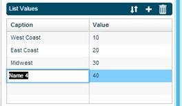
To remove a row from the list, select it and click  .
.
Use the Reorder  option to move the items on the list to other positions.
Selection Type
Specify the type of selection allowed for this parameter:
· Single value: A single value can be selected.
· Multiple values: Several values can be selected using Ctrl-click or Shift-click.
Initial Value
The value that should be the initial selection.
Visualization
Specify the type of control to be used for selection: Option Buttons, Buttons, Drop Down, List, Slider.
Free Text
This option is used to define a text control where the user can enter free text. Other components can use the Free Text parameter values via a placeholder that will be replaced by the string that a user enters in the navigation component.
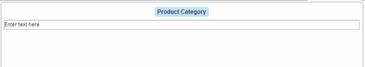
After selecting Free Text, use the fields of this option as described below:
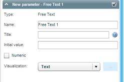
Name
Enter a name for the parameter. You will use this name when embedding this parameter in a formula or as a placeholder. If you don’t enter a name, the parameter name will be “Free Text 1”.
Title
The name that will appear as the title of the parameter in the navigation component. Use # as a placeholder for the selected value.
Initial Value
The string that should display as the initial value.
Numeric
Select this check box to allow only a numeric value in the text control.
Visualization
The type of control is Text. This option cannot be changed.
Auto Calculated
This option is used to define a view-based parameter using MDX.
After selecting Auto Calculated, use the fields of this option as described below:
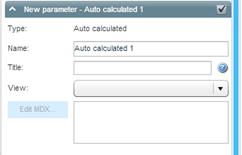
Name
Enter a name for the parameter. If you don’t enter a name, the parameter name will be “Auto calculated 1”.
Title
The name that will appear as the title of the parameter in the navigation component. Use # as a placeholder for the selected value.
View
Choose the view to connect the parameter.
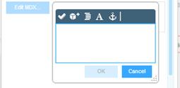
Edit MDX
Click the Edit MDX button and enter the MDX statements in the editing box. Click OK.