 on the title bar of the map component opens the map menu.
Clicking the arrow on the title bar of the map component opens the map menu.
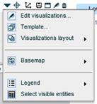
The map menu contains the following options:
This option opens the Map Designer dialog box for editing the map. In Design Mode, you can also use the standard Edit  button on the title bar to open the Map Designer.
This option opens the template selection dialog box.
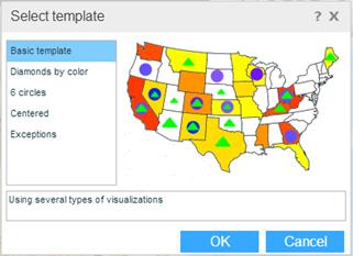
If you want to apply another template to the chart, select a template. The map on the right shows a preview of the visualizations for that template. Click OK.
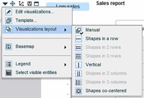
You can arrange the shapes on the map in several ways. Select Visualizations Layout from the menu, and then select the relevant layout. Manual means the shapes will be arranged according to the offset values specified in the visualization definitions.
The Basemap option opens a menu with map display modes to choose from.
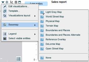
All the maps are world maps. Select the mode you want to display.
The Legend option opens a menu with legend options.
In addition to the standard buttons, the title bar of the map component contains option buttons for selecting dimensions, zooming and changing the display.
Clicking the Zoom to Selection  button on the title bar zooms in to the data selected on the grid.
When the Always Zoom to Selection option in the Map Designer is selected, the map automatically zooms into a selection you make on the grid.
You can zoom in or out on the map using the scale on the left.
The Dimensions Selector button on the title bar of a map component opens the Dimensions Selector window where you can easily edit the view to which the map is connected, and the data in it.
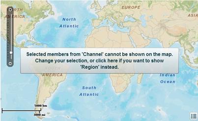
If you replace the Y-axis of the view with a dimension that is not geographic, a message appears in the map component advising you to change your selection to a geographic dimension that Necto automatically picks from the list of dimensions. To accept the automatic selection, click on the map.
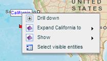
Clicking on a geo-entity (dimension member) on the map opens a context menu that is similar to the member menu that opens on the grid. This menu contains the options that can be applied to the entity on the map: Collapse, Expand to a lower level, and Show a level.
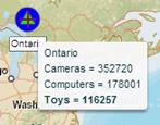
Pointing to an entity on the map displays a tooltip with the relevant values from the grid.
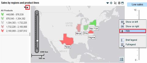
The map legend shows the visualizations used for the grid columns and the scale of values, in full or brief mode. The legend is an independent object and you can hide it, change its position and resize it.
To hide the map legend:
Click the Legend  button and select Hide in the legend menu. Or, click
  on the legend.
To show the map legend or change its position:
Click the Legend button or the arrow on the legend, and select the position you prefer.
To display the legend in brief/full mode:
Click the Legend button or the arrow on the legend, and select Brief Legend or Full Legend.
All the data from the grid of the connected view is also displayed in the map component and when you make changes in the grid, the map component changes according to your selection. You can choose to display in the map component only a certain part of the grid data by selecting that area. This is the same as selecting grid data for a chart in a view component.