Creating HTML Component Contents
When you drag the HTML Component  icon from the Toolbox on the Design tab of the ribbon to the desired area on the workboard, the HTML Component dialog box opens for designing an element with HTML code and JavaScript. This dialog box is also activated by clicking the Edit
  button on the Design tab of the ribbon.

The HTML Component dialog box provides a full-featured HTML editor which has both visual (WYSIWYG) and HTML tag/source modes.
In Normal (visual) mode, you add content (text, tables, date, time, emotions, etc.) using the editing and formatting functions and tools from the toolbars at the top.
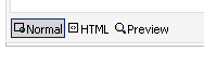
HTML (source code) mode displays the source code. In this mode, you can add HTML tags and JavaScript.
Preview mode lets you instantly see what the component contents will look like.
In Raw HTML mode, you can work with code that is not strict HTML. To switch to this mode, select the Raw HTML Edit Mode option.
Use the options to the right of the upper toolbar to insert images, Flash objects, media objects, downloadable files, templates and YouTube videos.

Use the Help button to display help about the options.
You can embed placeholders within the HTML in order to dynamically fetch information that is relevant to the currently displayed view data. Click Insert Placeholder and choose the placeholder.

Click OK to display the HTML elements in the HTML component.
Use Case Examples
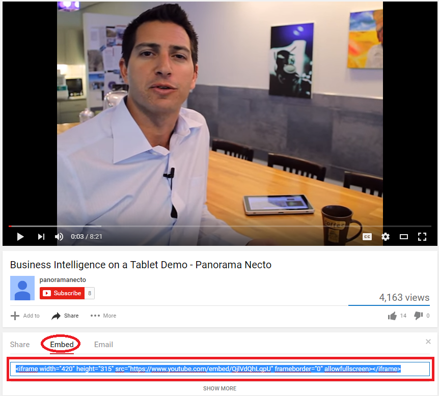
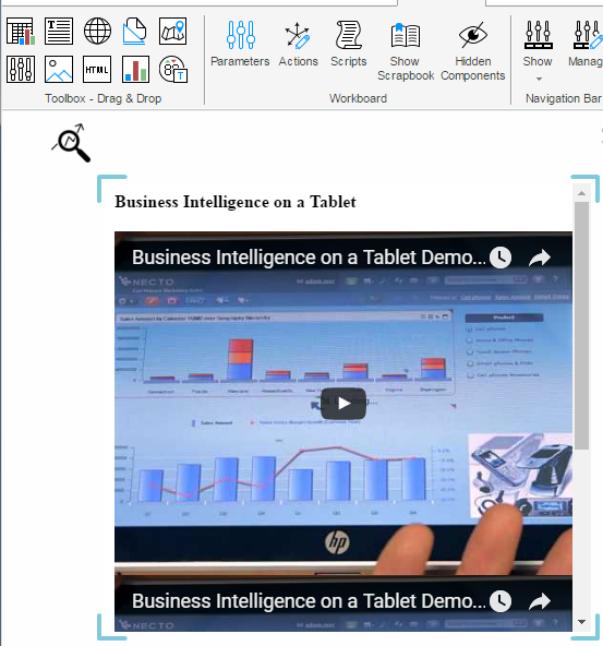
Example 1: Embedding a YouTube Video
To embed a video from YouTube in an HTML component:
1. Display the video in YouTube.
2. Click the Share and then the Embed option.
3. Copy the code.
4. In the HTML Component dialog box, switch to HTML (source code) mode and paste the code.
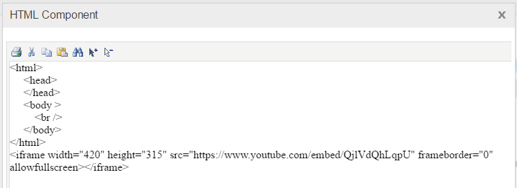
Check the results using the Preview option.
5. Click OK to display the video in the HTML component in the workboard.
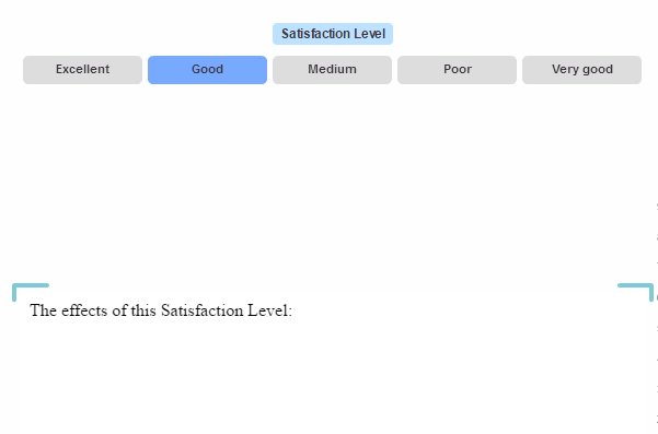
Example 2: Using Navigation Component Parameters and Placeholders with HTML
1. Use the Parameters Designer from a navigation component to define and place in the component, a parameter of Dimension Members type to slice data by the members of the Satisfaction Level dimension.
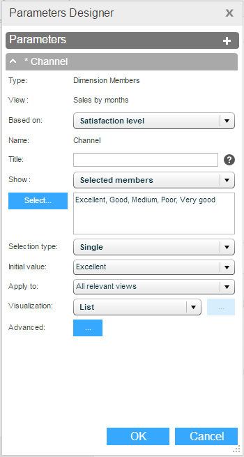
2. Use the HTML Component dialog box to build content that is relevant for satisfaction level. Use the %[Satisfaction Level] Caption% placeholder to fetch the satisfaction level member name with the selection in the navigation component.
When a member will be selected in the navigation component, the view will be sliced by that member and the contents of the HTML component will show information for that satisfaction level.