
The infographics entity properties contain definitions that apply at the entity level: the entity’s caption, the tooltip displayed to the end-user, the background color, the animation style, the actions that can be executed from an entity, and more.
Note that actions can be defined at infographics family, entity and graphic object levels.
From the dropdown list at the top of the Properties Pane, select the entity level in order to display its properties.
For properties that include the Data Link  icon, you can define a rule to control that property and connect it to the actual data. For example, if a value is larger than n, return the color red. After defining a data link, the icon changes to
  and a tooltip shows the details.
Choose the type of presentation the entity will be used for:
· As tile: can be used only in an infographics component. This is the default form.
· As list: can be used only in an infographics component. This type of presentation enables you to design a table-like list of member values. The list can contain three sections, with a header, footer and body.
· In grid: can be used only as in-cell visuals in grids (and connected maps).
Note that in addition to the general entity properties, presentation types also have specific properties. For example, the Animation and Actions properties are relevant for tile and list forms but not for the in-grid form.
This is the ID of the entity. It is automatically assigned to the entity and cannot be changed.
The display name that will appear in the Infographics Entities pane.
This is the tooltip that appears when hovering over the infographics in the repository.
Click on the value column and then click the down arrow. Enter the tooltip text in the edit box. Click OK.

You can use the Data Link option to define a rule or a custom formula to display a tooltip text.
The tooltip will look like this:

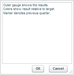
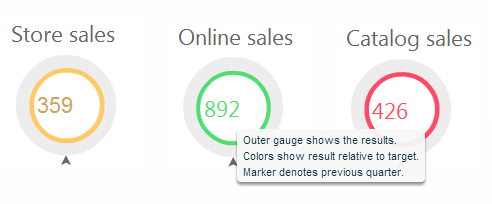
This is the tooltip that appears when the end-user hovers over the infographics on the workboard.
Click on the value column and then click the down arrow. Enter the tooltip text in the edit box. Click OK.
You can use the Data Link option to define a rule or a custom formula to display a tooltip text.
On the workboard, the tooltip will look like this:
This property shows the number of parameters used (from the infographic family’s parameters) in the current entity and its graphic objects.
Click on the value column and then click  to open the Parameters window where you can view the parameter definitions and reorder
  them.
them.

Hovering over a parameter tab displays a tooltip with the parameter name, the parameter type and the current value if there is one.

This property is used to generate animation at the infographics entity level, which will occur when member selection is performed in the workboard, or when a time selection occurs.
Click on the value column and then click to open the Infographics Animation window.

In Animate Through, select the relevant option:
Member Selection
The entity will be sliced according to the selected members, and animation will occur through the slicing.
Select a dimension, and then members from that dimension.

Set the Frequency in seconds.
Members Expression
Define an MDX statement that returns a list of members. Animation will occur through these members.

Set the Frequency in seconds.
Time Selection
Define the time selection options and then set the Frequency in seconds.

In Periods Dimension, select Auto (default) for automatic selection of the first date in the list of slicers. Select Date or Date Hierarchy to select from the current Date dimension or Date Hierarchy.
In Last Period, select Auto to take the last period from the currently sliced period in the workboard. Select Last Date to take the last period with data at the level of the currently sliced period. Select one of the other options (e.g. Last Date – Months) to take the last period with data, at the selected level.
To find the last period using a measure other than the default measure, select it in Find Last Period Using.
Choose the Number of Periods to Show and specify whether this is for Previous or Parallel periods. For example, if the selection is Last Date – Months for 3 parallel periods, and the month is January, then last 3 Januaries will show.
In Periods Selection, the default selection is N Last Periods, meaning that the selected number of last periods will show. The First Period AND Last option will show only two members – the first and last periods according to the selections, and will draw a line between them.
The Summary area will explain your selections.
Set to Yes to enable the defined animation.
The width and the height of the infographics entity, in terms of tiles or pixels depending on the selection in Units. For in-grid and list, the unit is pixels.
Click to open the palette and choose a color for the entity’s background. Or, use the Data Link option.
Set to Yes in order to ignore the background color setting.
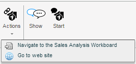
This property is used to define actions for tile or list type entities. The actions will be available for execution by clicking the Actions  button on the Infographics tab of the ribbon in a workboard, or by clicking on the entity.
To define actions:
1. Click on Actions List and then click the down arrow.
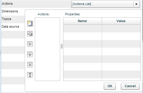
2. Click the Create  button and click on the value column. From the dropdown list, select an action.
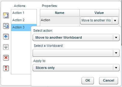
Move to another workboard
Clicking on the action will move the user to the workboard defined in this property.
Choose Move to another workboard, and in Select a Workboard choose the workboard to navigate to.
Click OK.
Open a browser window
Clicking on the action will open the specified web page in a browser window.
Choose Open a browser window, and in Enter page URL type in the page address.
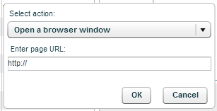
Click OK.
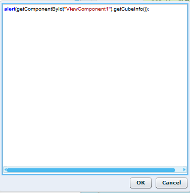
Execute a JavaScript expression
Clicking on the action will execute the entered JavaScript code.
Choose Execute a JavaScript expression.
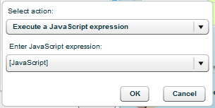
Click the arrow in Enter JavaScript expression and type in the code.
Click OK.
3. In Caption, the action’s caption appears automatically. This caption appears in the action’s tooltip. Click on it to edit it.
4. Click OK.
If the action is “Move to another workboard”, when the end-user will perform this action to move to another workboard, the current slicing in the workboard will apply to the other workboard. If you want the action to ignore the original slicing and move only certain dimension members, use the Actions Context property to define those members.
Click on Actions Context and click the down arrow.
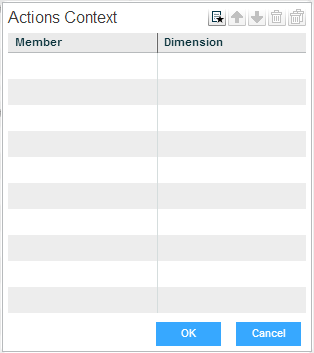
Click on the Member column and then on the down arrow. Select a dimension member.
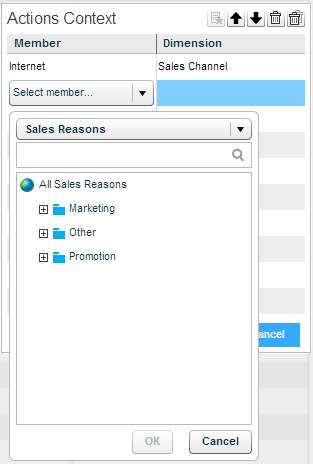
Repeat this for more dimension members. Click OK.
When set to Yes, the action will be performed directly when the end-user clicks on the entity.
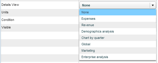
This property enables you to connect the entity to another entity in the infographics family. The Details button appears on the entity’s toolbar in the infographics component and the end-user can click it to display the connected entity.

In the Details View property, select the entity.
The infographics unit of measure can be tiles or pixels. The width and length will be specified according to the selected unit.
When set to Yes, the entity is visible to the end-user, for selection.
For an in-grid entity, set to Yes in order to display the cell value together with the infographic.
For an in-grid entity, select a method for performing automatic sizing in a grid cell.
The following properties appear only when the Presentation type is As List.
Members
Select the members to show in the list, in the same way as in the Animation property.
Header, Footer Height
Specify the height in pixels, of the header and footer sections of the list. Zero height means that that section will not display. In the following example, the header and footer height is 15 pixels.

List Columns, Rows
The number of columns and rows. Auto means the number will be set automatically. You can use the Data Link option to calculate the columns and rows.
Visible Rows
The number of rows that will be visible. Auto means the number will be set automatically. You can use the Data Link option to calculate the visible rows.
List Layout Direction
The direction can be Left to right or Right to left.
Horizontal, Vertical Margin
The horizontal and vertical margins in pixels.
Body, Header, Footer
For each of the sections of the list, set the borders and colors.