The Design Canvas is where you design the infographics entity by adding graphic objects.
The canvas area displays the infographics entity while designing it.
At the top of the canvas are the Actions toolbar and the Graphics toolbar.
The Actions toolbar contains the following action buttons:
|
Action |
Description |
|
|
Cancels the last action. |
|
|
After undoing an action, you can execute it again by clicking the Redo button. |
|
|
Resizes the canvas. |
|
|
Draws grid lines on the canvas. Clicking again hides the grid lines. |
|
|
Cuts the selected graphic object from the canvas. |
|
|
Copies the selected graphic object. |
|
|
Pastes the copied graphic object. |
|
|
Removes the selected graphic object from the canvas. |
|
|
Adjusts the entity to fit its content. |
|
|
Displays a preview of the infographics entity. |
|
|
Imports graphics from another infographics entity. |
The Graphics toolbar contains the icons of the graphic objects you can use for designing the infographics entity:
|
Icon |
Use for adding |
|
|
Text. You insert the text via the Text property in the Properties Pane. |
|
|
An image. You choose the image via the Image property in the Properties Pane. |
|
|
Image repeater. You choose the image to be the basis of the repeat via the Image property in the Properties Pane, and the designated area on the canvas becomes filled with the image. |
|
|
An arc shape. |
|
|
A rectangle or a circle (rectangle with rounded corners). |
|
|
A triangle. |
|
|
A line. |
|
|
An arrow. |
|
|
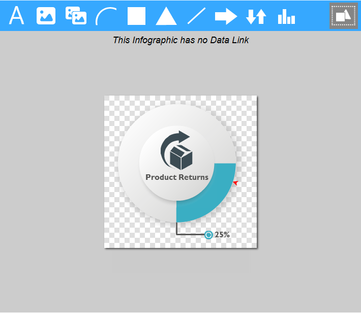
An image that represents a state or a trend. You choose the image via the Image property in the Properties Pane. |
|
|
A chart. |
The selection  button on the Graphics toolbar switches the canvas to multiple selection mode. In this mode, click in a blank area on the canvas and drag the selection rectangle around the desired area. All the objects within will be selected.