You can use the formatting options on the Format tab of the ribbon to customize the look and feel of the grid and chart in a selected view. Most of these options are also available as Grid and Chart properties in the Properties Pane.
Click on ![]() to display the grid formatting options. If they are disabled, click the Inherit
to display the grid formatting options. If they are disabled, click the Inherit ![]() option (when Inherit is selected, the view inherits properties from the workboard) to enable the formatting options.
option (when Inherit is selected, the view inherits properties from the workboard) to enable the formatting options.
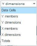
Then, select the element to which you want to apply the changes.
Use the formatting options, in the following way:
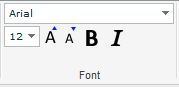
Font
Change the font, font size, and the typeface (bold, italic) of the selected element.
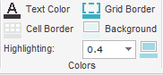
Colors
Open the palette for Text Color, Cell Border, Grid Border and Background, and select a color. In Highlighting, select a color for the highlighting effect and change the opacity (color alpha).
Alternate Color
For alternating row or column colors, click Rows ![]() or Columns
or Columns ![]() . Click NONE if you don’t want to use alternate colors. Then, select the alternate color alpha. Click
. Click NONE if you don’t want to use alternate colors. Then, select the alternate color alpha. Click ![]() to apply the selections also to the axis (member names).
to apply the selections also to the axis (member names).
Cell Size
To change the size of the grid cells, click Cells Size ![]() , or select Settings from the Layout
, or select Settings from the Layout ![]() menu in the View tab.
menu in the View tab.

You can change the cell width for the X- and Y-axes in terms of number of characters. Necto performs automatic alignment according to the number of characters. If a value is longer than the maximum number of characters, word-wrapping will occur.
You can also change the cell height for X-axis members (for the text lines), and set the minimum number of columns to show on the X-axis.
To distribute columns evenly, select the Same width for all axis X columns option.
Click on ![]() to display the chart formatting options. If they are disabled, click the Inherit
to display the chart formatting options. If they are disabled, click the Inherit ![]() option (when Inherit is selected, the view inherits properties from the workboard) to enable the formatting options.
option (when Inherit is selected, the view inherits properties from the workboard) to enable the formatting options.
Then, select the element to which you want to apply the changes.
Use the formatting options, in the following way:
Font
Change the font, font size, and the typeface (bold, italic) of the selected element.
Chart Type
From the menu, select the chart type you want to display.
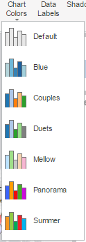
Chart Colors
From the menu, select a color template.
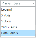
Data Labels
Click Data Labels ![]() to hide or show the data labels on the chart.
to hide or show the data labels on the chart.
Shadow
For shadow effect, click Shadow ![]() .
.
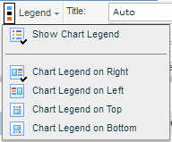
Legend
To hide the chart legend and change its position, click Legend ![]() . In the Legend menu, select an option.
. In the Legend menu, select an option.
Rotate
By default, the chart engine plots the vertical axis of the grid as the data series and the horizontal axis of the grid as the values. Use the Rotate ![]() option to rotate the chart axes.
option to rotate the chart axes.
Axes
You can add titles to the X- and Y- axes of the chart, which will display to the left (of Y) and below (of X) the data labels. Type in the title text in Title.
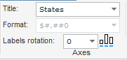
If the data labels in an axis are measures, you change their display format: click on the axis and select a format from the Format dropdown list.
To display the labels on the X-axis in slanted mode, select the rotation degree in Labels Rotation. To display them in staggered layout, click ![]() .
.
Scaling
The Scaling ![]() option allows you to change the scaling of the Y-axis, and the second Y-axis if there is one.
option allows you to change the scaling of the Y-axis, and the second Y-axis if there is one.
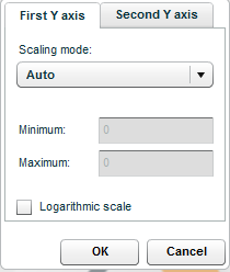
Select a Scaling Mode. The default mode is Auto (automatic scaling).
In Auto mode, you can use Logarithmic Scale to suit wide data ranges.
In Auto mode the minimum value of the scale is 0, whereas in Auto Minimum mode the minimum is calculated automatically.
If you choose Custom, enter the Minimum and Maximum values of the scale.
Series
Select the series to which you want to apply the changes.
Change the color ![]() .
.
For line, area and plot charts, you can do the following:
Select a marker ![]() .
.
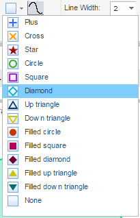
Click ![]() to smooth lines.
to smooth lines.
Set the Marker Size and the Line Width. To plot only data points without a line, click Only Data Points ![]() .
.
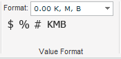
On the View tab of the ribbon, you can use the Value Format option to change the display format of the values (of the current measure) in the grid.
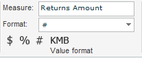
Select a format from the dropdown list in Format, or click on one of the formats: $ for currency format, % for percentages, # for integer format, and KMB for K (thousand), M (million) B (billion) format.
The values in the grid will be displayed according to your selection.
When Measures is in one of the axes of the grid, it is possible to change the format of each measure (member) via the Value Format option on the Members tab of the ribbon. Click on a member in the Measures dimension and select the format.