The component title bar contains the title text and three standard option buttons.
For the view and chart components, the title bar also contains component-specific option buttons.
For a view component, the title text is generated automatically. For other components, Necto displays the name of the component type.
You can change the generated title of a view component, and the titles of other component types via the Caption Text property of each specific component. For explanations about changing component properties, see Customizing the Workboard and its Components and Component Properties.
The Maximize  button maximizes the component to fit the entire workboard contents area. In the following example, the map component has been maximized.
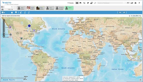
Maximizing a view component, switches the workboard to View Maximized Mode.
Clicking the Restore  button in the title bar restores the maximized component to its original size.
The Wizard  icon is available only in Design Mode
  . It is used to create and edit component contents. For explanations about creating component contents, see Chapter 5. Workboard Component Contents.
The Delete button is available only in Design Mode .
To delete a component, click the Delete  button on the component’s title bar.
You can Undo  a delete operation.
The Show Title property enables you to hide the title bar of a component.
The component Actions property can be used to define an action to be executed from the title of a component.
The Buttons property can be used to add buttons to the title bar of a component, for performing additional actions.
For further explanations, see Component Properties.