 button opens the list of infographics for adding more entities.
In addition to the standard buttons, the title bar of the infographics component contains the following option buttons.
The Add Infographics button opens the list of infographics for adding more entities.
The Dimensions Selector button opens the Dimensions Selector window.
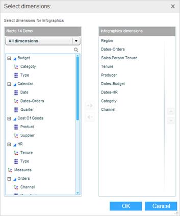
The pane on the left shows the dimensions of the data source to which the infographics family is connected.
The Infographics Dimensions pane shows the dimensions of the infographics. You can add and remove the dimensions in this pane.
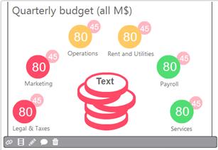
When you click on an infographics entity in the infographics component, a toolbar appears at the bottom.
The Parameters  button appears when parameters are defined for the infographics. It opens the parameters dialog box where you can enter and modify parameter values and definitions.
Use the Data Link  button to open the Data Link dialog box where you can make the modifications.
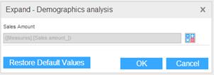
Use the  button to restore the parameters to their default values.
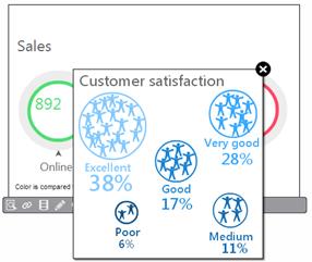
The Show Detailed Infographic  button appears on the toolbar if a detailed view has been defined for this entity. Clicking the button shows the detailed view.
The Actions  button opens a menu with the actions defined for the infographics.
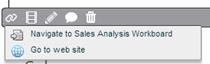
Select an action to execute it.
The Animation  button opens the Infographics Animation dialog box for generating animation by switching among the infographics entities.
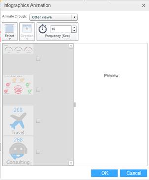
Select an Effect and the Direction of the movement. Set the Frequency in seconds.
Select the entities that should participate in the animation. The Preview pane will show the results.
Click OK.
The Modify Infographic  button opens the Infographics Designer for the infographic entity, and enables you to modify its graphic design and properties.
The Start Discussion  button opens a new discussion based on the infographics.
The Delete  button removes the infographics entity from the component.